109 results
9th grade graphing resources for Microsoft Excel
Excel Lessons - Creating Charts
No Prep! These lessons are great as a first Excel Chart lesson or for students already a little familiar with creating charts. Students love the data for these charts because the data is centered around things they love – their cell phones! In Lesson 1, students will create 5 different charts from step-by-step directions which include Chart Titles, Chart Styles, Axis Titles, Data Labels, and Moving Chart to its own Sheet.In Lesson 2, students will create 5 charts from provided data as well as ch
Grades:
5th - 12th
Types:
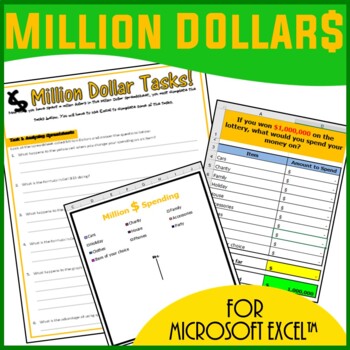
Excel Spreadsheets Million Dollars Activity
This resource allows students to understand the following: How graphs change when spreadsheet data is alteredUse of SUM() functionsHow graphs are madeComponents of a graphAdvantages of spreadsheets over pen and paper methodsStudents use this resource to understand how altering data in spreadsheets allow graphs to change. They understand such concepts by trying to spend a Million Dollars in a minute. Students are then expected to complete the associated worksheet which accompanies the spreadsheet
Grades:
5th - 12th, Adult Education
Types:
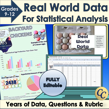
Real World Data for Statistical Analysis and Infographic Project
Give your students access to real world data for your statistical analysis unit or data literacy! Dive into statistics with Microsoft Excel™ or Google Sheets™ and years of data. Learn how to use standard deviation, mean or median to interpret data. Choose the best graphs to display conclusions in an infographic. Works great for science fairs! ✔ Includes an infographic project! (Template, expectations, and rubric). ✔ Everything is fully editable and you and your students can even use the images
Grades:
9th - 12th
Types:
CCSS:
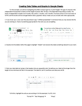
Creating Data Tables and Graphs in Google Sheets
This is an activity that walks students through the process of organizing and entering data into a data table and then using that data to generate line, bar, and pie charts. Once the graphs are generated, the process of formatting and editing the different parts of each graph is explained.

Parabola Transformations - Interactive
A handy guide to help new students learn how each change affects the shape and direction of parabolas. Clear color coding for the various pieces of the formula and instant updates help separate and isolate the concepts for easy, intuitive learning.Enter information using simple dropdown menus and organized blank fields to isolate each piece of the formula!Two tabs:One allows you to enter individual pieces of information to show the resulting formulaOne allows you to enter the formula to show the
Subjects:
Grades:
7th - 12th, Higher Education, Adult Education
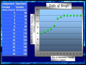
LINE GRAPH MAKER (AUTOMATIC)
This spreadsheet allows you to insert your independent and dependent variables into a chart and voila!... a line graph is generated as you enter in each piece of new data! Students love to take their data from a lab and watch as a graph is made right before their eyes! You can change all of the titles on the chart and the graph to suit your classes laboratory experiment needs! Students can easily print out their data to include in their lab reports!
Grades:
2nd - 12th
Types:
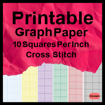
Printable Graph Paper 10 Squares Per Inch Cross Stitch
Printable Graph Paper 10 Squares Per Inch Cross Stitch - Grid paper is essentially the type of paper most commonly used for drawing and sketching purposes. It is widely used for making plan charts, designing websites, developing home ideas and so forth. A great deal of businesses who need to produce a company card, business brochures, catalogues, brochures, and so forth need this kind of graph paper.
Subjects:
Grades:
5th - 12th

Water Balloon Catcher Project - Data and Graphing - Mathematics
Transform your maths classroom into a dynamic hub of learning with this captivating data and graphing project! Designed for upper primary/middle school students, this hands-on and inquiry-based activity ensures an immersive experience in mastering data interpretation, chart creation, and understanding the role of data and graphs in advertising.In this engaging project, students will: Explore Data: Collaborate in teams to design and construct a Water Balloon Catcher using recycled materials, each
Subjects:
Grades:
5th - 9th
Types:
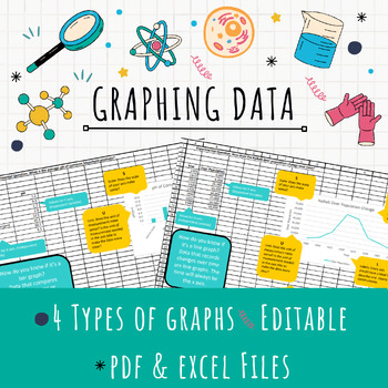
EDITABLE Excel Graphing Template
Teach graphing in Excel with this EDITABLE template! After collecting data, have your students represent it in a formal graph using Excel. This template provides helpful tips for students to determine the right kind of graph (bar, line, or pie) for their data and ALSO teaches them all the important parts of a graph.Assign the template for students to download and edit for a quick graphing solution or provide the pdf handouts for students who just need a little guidance!4 different kinds of graph
Grades:
7th - 12th
Types:
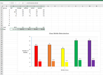
Skittle Statistics MS Excel Mini-Lab
This is a 1 class MS Excel lab for a computer or math class. You can have the students explore the distribution of different color Skittles in class. This is a great mini-lab or half-day activity when you school ends up with a weird schedule day. Tell them they can't eat till the Skittles till the end of class, or they will distort their numbers. Also make sure they don't throw them or shove them up their nose (Yes, stuck Skittles are hard to extract, ask me how I know..)The goal of this lab is
Grades:
6th - 12th, Higher Education, Adult Education
Types:
NGSS:
MS-ETS1-2
, HS-ETS1-2
, HS-ETS1-3
, MS-ETS1-4
, MS-ETS1-1
...
Also included in: Hands-on Science Semester Labs Bundle
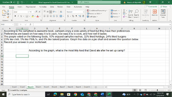
What Happened to David Graphing Exercise
This is a graphing exercise where students have to work through a series of graphing challenges to find out what happened to David. I would suggest that the first one be done as a class and that the What Happened to David Handout is also purchased to go along with this exercise (found on my page). Sheets 1-5 are student pages and sheets 6-10 are the answer key.
Grades:
8th - 10th
Types:
Also included in: What Happened to David Bundle
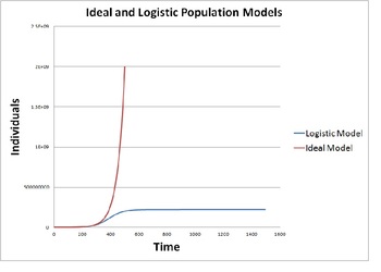
Modeling Population Growth (Ideal vs. Logistic Model)
This activity provides instructions to construct a mathematical model on a blank spreadsheet that simulates population growth using an ideal model and a logistic model. The activity provides background discussion and then gives instructions on how to program a spreadsheet to produce and display the ideal and logistic population models. Their results are studied for various cases including human population, rabbits, polar bears, bacterial and yeast colonies.
This quantitative population model
Subjects:
Grades:
9th - 12th, Staff
Types:
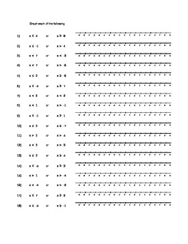
Compound Inequality Graphing Practice
This excel spreadsheet includes a sheet of practice for both AND and OR compound inequalities. There are also three sheets of blank number lines, so that a teacher could write their own inequalities for students to graph.
Grades:
5th - 9th
Types:
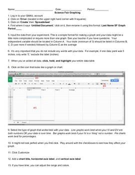
How To Graph Using Google Spreadsheets
This is a step-by-step guide on how to use Google Spreadsheets for students in grades 5-12. Use this as a resource when guiding students through the process. Included with the directions is sample data for students to use when practicing graphing. Perfect for science experiments and science fair!
Subjects:
Grades:
5th - 12th
Types:
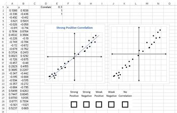
Correlation Graph Generator
Have you ever wanted to generate randomized scatter plots for images to use in class notes, assignments, or tests? Look no further! This spreadsheet generates high resolution scatter plots with each of the following relationships:- Strong Positive Correlation- Weak Positive Correlation- Strong Negative Correlation- Weak Negative Correlation- No CorrelationEach scatter plot is formatted in two ways:- With graph title and line of best fit (for instruction)- With no title or line of best fit (for
Subjects:
Grades:
9th - 12th
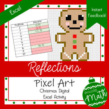
Christmas Pixel Art | Reflections | Digital Geometry | Instant Feeeback
Product Description: This Christmas themed, pixel art activity covers reflections! Students are given three points on a graph and asked to reflect one of the points. There are 10 problems. Students will reflect over the y-axis twice, the x-axis twice, the line y=x twice, a horizontal line twice, a vertical line once, and the y=-x line once.Objective: Students will be able to reflect points over various lines of reflection.Excel Student Instructions: Students will work all ten problems on the pro
Subjects:
Grades:
7th - 11th
Types:
Also included in: Christmas Transformation Bundle
Stock Market Project
Students will select 3 companies to follow on the stock exchange over a 4 week period. Each week they will record their company's last trade. Over the 4 weeks they will look at information on the companies, news articles on the companies, how much money they would have made or lost if they had 100 shares of the stock. At the end they will create a spreadsheet and write a summary of their findings.
Grades:
6th - 10th
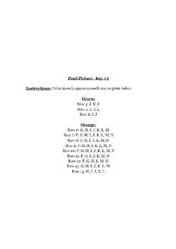
Halloween Pixel Art Excel/Google Sheets
Microsoft Excel activity to use upper elementary or middle school students? This great lesson incorporates art as students learn the basics of Microsoft Excel.These are also fun lessons to use if you just need something for a one day lesson.
This download includes:
1. Teacher & Student Resources
2. Excel Template for Pixel Art
3. Legends and Sample Pictures for 3 Halloween Pictures
When completed let students make their own pictures, they will love it!
I've used this with 6th and 7th gra
Subjects:
Grades:
5th - 9th
Types:
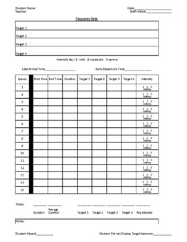
Behavior Frequency Rate Chart w/ Target, Intensity, Duration, BIP chart/Summary
Behavior Frequency Rate Chart (dates and chart cant be edited and dates changed to current year or target)--Daily Sheet-Date Entry-Intensity Chart-Duration Chart-Target Charts-BIP Evaluation printout -BIP write upSee preview for description Excel format for editing - tabs at bottom of page for easy change of view and data entry
Subjects:
Grades:
PreK - 12th
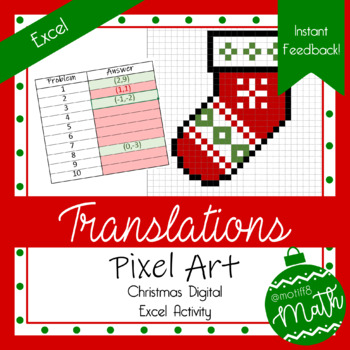
Christmas Pixel Art | Translations | Digital Geometry | Instant Feedback
Product Description: This Christmas themed, pixel art activity covers translations! Students are given three points on a graph and asked to translate one of the points according to the given translation rule.Objective: Students will be able to translate a point on a graph.Excel Student Instructions: Students will work all ten problems on the problems tab and then input their answers on the image tab. When entering their answers, students must use parentheses, a comma, and NO spaces. As students
Subjects:
Grades:
7th - 11th
Types:
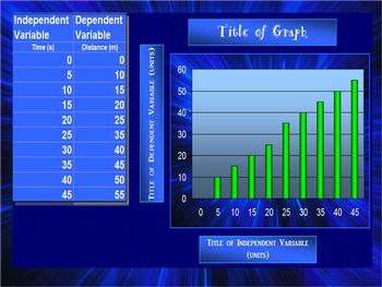
BAR GRAPH (AUTOMATIC)
This spreadsheet allows you to insert your independent and dependent variables into a chart and voila!... a bar graph is generated as you enter in each piece of new data! Students love to take their data from a lab and watch as a graph is made right before their eyes! You can change all of the titles on the chart and the graph to suit your classes laboratory experiment needs! Students can easily print out their data to include in their lab reports!
elementary science class, middle school sc
Grades:
2nd - 12th
Types:
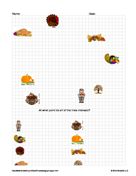
Point-Slope Form Turkey Hunt (Thanksgiving)
use this activity with your students to practice Point-Slope form. Worksheet comes as an excel file with different options. You can have students draw given lines that hit each of the graphics on graph and find the intersecting point OR have students create their own lines that hit each of the graphics and write an equation for those lines.
This is a quickly put together activity, I will go back and edit it for beauty and glamour over the break weekend :)
Grades:
8th - 12th
Types:
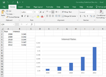
Correcting Statistical Bias with Answer Key
Correcting Statistical Bias is a great tool to use when teaching about statistical bias in the media, news, sports, and politics.It includes 4 graphs that have been manipulated to show bias.You can get your students to practice un-manipulating the graphs using the provided hints to show the real story behind the data and help your students to become more statistically aware.
Subjects:
Grades:
8th - 12th
Translations Christmas Bundle | Excel Pixel Art & Google Forms | Feedback
This Christmas bundle includes a 10 question Pixel Art Activity and a 10 question Google Form covering translations. The Pixel Art activity is more of an introduction to translations and the Google Form consisted of more advanced questions! This bundle would also be a great way to differentiate within your classroom or have options for a choice board! Please review each product individually for more details!Christmas Translations Pixel Art ActivityChristmas Translations Google Form
Subjects:
Grades:
8th - 11th
Types:
Showing 1-24 of 109 results

