Create Line Graphs in Excel
David Baxter
169 Followers
Grade Levels
8th - 12th
Subjects
Resource Type
Formats Included
- Word Document File
- Excel Spreadsheets
Pages
10 pages
David Baxter
169 Followers
Description
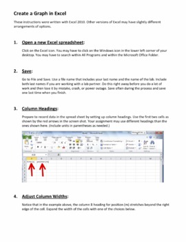
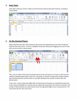
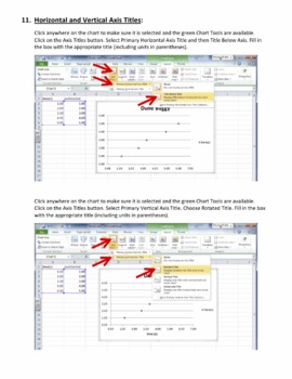
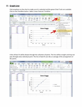
This instruction guide walks students (and us teachers) through the process of entering data into an Excel spreadsheet and turning it into a line graph. This 10-page guide contains numerous screen shots to help explain each step.
The guide can be used along with laboratory investigations and projects common to physics, chemistry, and biology, as well as courses in mathematics, economics, meteorology, sociology, etc. If your students need to learn how to graph the data they collect, this guide will show them how to do it!
This guide covers the basics as students learn to:
1) Open a new Excel Spreadsheet.
2) Save.
3) Create column headings.
4) Adjust column widths.
5) Enter data.
6) Adjust decimal places.
7) Graph the data.
8) Move and resize the chart.
9) Use chart tools.
10) Enter a chart title.
11) Enter horizontal and vertical axis titles.
12) Create a line of best fit.
13) Tag their work with their names.
14) Save and submit their finished graphs.
This 10-page guide can be printed and used as a handout or saved as a pdf and uploaded to an online course management site such as a moodle site so that students can return to the instructions throughout the year as needed. The guide can be altered to fit the needs of your classes and your students.
The graphs that students produce can either be printed on paper and handed in or submitted by email for easy grading.
Total Pages
10 pages
Answer Key
N/A
Teaching Duration
40 minutes
Report this resource to TPT
Reported resources will be reviewed by our team. Report this resource to let us know if this resource violates TPT’s content guidelines.


