TPT
Total:
$0.00

Data Displays: Line Plots, Histograms, Box and Whisker Plots, Frequency Tables

Rated 4.8 out of 5, based on 415 reviews
4.8 (415 ratings)
;
Math Central
1.5k Followers
Grade Levels
6th - 8th
Resource Type
Standards
Formats Included
  • PDF
Pages
48 pages
$5.00
$5.00
Share this resource
Report this resource to TPT
Math Central
1.5k Followers

What educators are saying

This was such a great resource for my students to review all of the different types of data displays we learned in math!
I used this with my students who need extra support and they were able to understand how to create this data sets with ease!

Description

This is one of my favorite teaching tools!

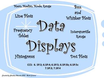
I created this Data Display set of worksheets this year for my 6th grade class. My students loved using these worksheets to practice their new skills. Each worksheet provides plenty of room for students to create their data displays and answer questions based on the data. Questions ask students to find the mean, median, mode, range, interquartile range, and percentages.

These worksheets are fully aligned with the Common Core Curriculum.

CCS: 6.SP.3; 6.SP.4; 6.SP.5; 6.SP.5b; 6.SP.5c 7.SP.3; 7.SP.4

Uses:

•Photocopy each worksheet and use them for practice, homework, and as a quick assessment of your students skills.

•Use them in a center or for a station activity.

•Display the worksheets on your white board or Smart Board and complete the data displays as a class.

•Include one of the worksheets in your next test.

•Use a worksheet or two as a quiz.

•Display the answer keys on the board for self checks.

A color and black and white copy are included.

Answer Key Included.

Check out my other products too!

Follow my store for updates and freebies!

Total Pages
48 pages
Answer Key
Included
Teaching Duration
Lifelong tool
Report this resource to TPT
Reported resources will be reviewed by our team. Report this resource to let us know if this resource violates TPT’s content guidelines.

Standards

to see state-specific standards (only available in the US).
Recognize that a measure of center for a numerical data set summarizes all of its values with a single number, while a measure of variation describes how its values vary with a single number.
Display numerical data in plots on a number line, including dot plots, histograms, and box plots.
Summarize numerical data sets in relation to their context, such as by:
Describing the nature of the attribute under investigation, including how it was measured and its units of measurement.
Giving quantitative measures of center (median and/or mean) and variability (interquartile range and/or mean absolute deviation), as well as describing any overall pattern and any striking deviations from the overall pattern with reference to the context in which the data were gathered.

Reviews

Questions & Answers

1.5k Followers