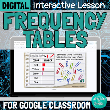
DIGITAL Frequency Tables Interpreting Data Interactive Lesson
- Google Slides™

Also included in
- This bundle of 3 digital interactive math lessons for Google Classroom teaches interpreting categorical and numerical data using frequency tables, bar graphs, and line plots. Each lesson includes: a video lesson (YouTube and Loom viewing options included) practice problems and activitiesteacher direPrice $7.35Original Price $10.50Save $3.15
Description
This interactive Google Slides lesson introduces students to frequency tables and demonstrates how to interpret both categorical and numerical data.
The lesson covers:
- the parts of a frequency table (title, categories, and tally marks)
- the difference between categorical and numerical data
- how to interpret data (answer questions) using a frequency table
- how to create a frequency table
This resource includes:
- a 9 minute video lesson (YouTube and Loom viewing options provided)
- 14 practice problems - students drag and drop tally marks to create 2 different frequency tables (one categorical and one numerical), then interpret the data to answer 6 questions about each
- teacher directions and answer keys
Assign this ready-to-go interactive lesson through Google Classroom (be sure to make a copy for each student so they can edit) and enjoy all the time you just saved!
This lesson is part of a collection of 3 interpreting data interactive lessons for Google Classroom. Buy the bundle here and save 30%
Please follow my store here for more great resources!
You can also find me on Facebook, Instagram, and lafountaineofknowledge.com where you'll discover ideas, inspiration, and plenty of freebies! Or join my email list to get a monthly newsletter with exclusive FREE resources you can't get anywhere else!
Want free money to spend on Teachers Pay Teachers? Rate this product to earn some TpT credit! Leaving feedback helps us both out and takes less than a minute! Your support makes it possible for me to continue making and sharing great resources! Thank you!


